

FlinkTO
For the Totally Obsessed
How We Got Here
If you’ve already seen the Flink12 or Flink* project pages you’ll know that the Flink product underwent a lot of changes during the 5 years I was with the company. It began as a private social network for friends which gradually evolved into a publishing platform for ‘Totally Obsessed’ fans. That leads us to this point.
This final stage of Flink – before it eventually split into two separate products (MoviesTO and MusicTO) – allowed users to create stories, contribute content to other users’ stories, share their expertise to earn status on leaderboards, and even earn Flink currency to subscribe to more stories. The concept was that this was ‘Where real fans share the things they love.’
Horizontal Is the New Vertical
I’m not sure what that even means but it sounded good when I wrote it. Anyway, what I’m referring to is the scrolling direction. The product had evolved into a story platform and we wanted to give the user a more unique way to experience those stories. We had also experimented with several content block layouts previously and felt that the horizontal structure worked well for displaying stories on various screen sizes. It would prove to be a challenge technically but we got there eventually.
*Note: At this point the product was still called FlinkFame.
Prototypes
Even though I had tried numerous layouts and believed the horizontal design would work I still needed to makes sure the stakeholders were on board. I created simple, interactive PDF prototypes to illustrate how the new UI would function.

Part of an early prototype illustrating the horizontal scrolling and story overlay.
User Flows
The prototype gave us a general sense of the UI so once the concept was approved I moved onto user flows which illustrated further interaction.

User flows showing detailed interactions.
Illustrating the Layered Hierarchy
When we first introduced the new horizontal UI we had content layered on top of other content. For example, if you were on a user’s profile and you clicked on one of their stories it would slide up over top of their profile. Then you could simply close the story when you were done and you’d still be at the same point on their profile page. This later proved to be confusing for some users so we made the required adjustments but below are the visuals I created to help the developers better visualize the layering.

Layered wireframes illustrating the hierarchy.
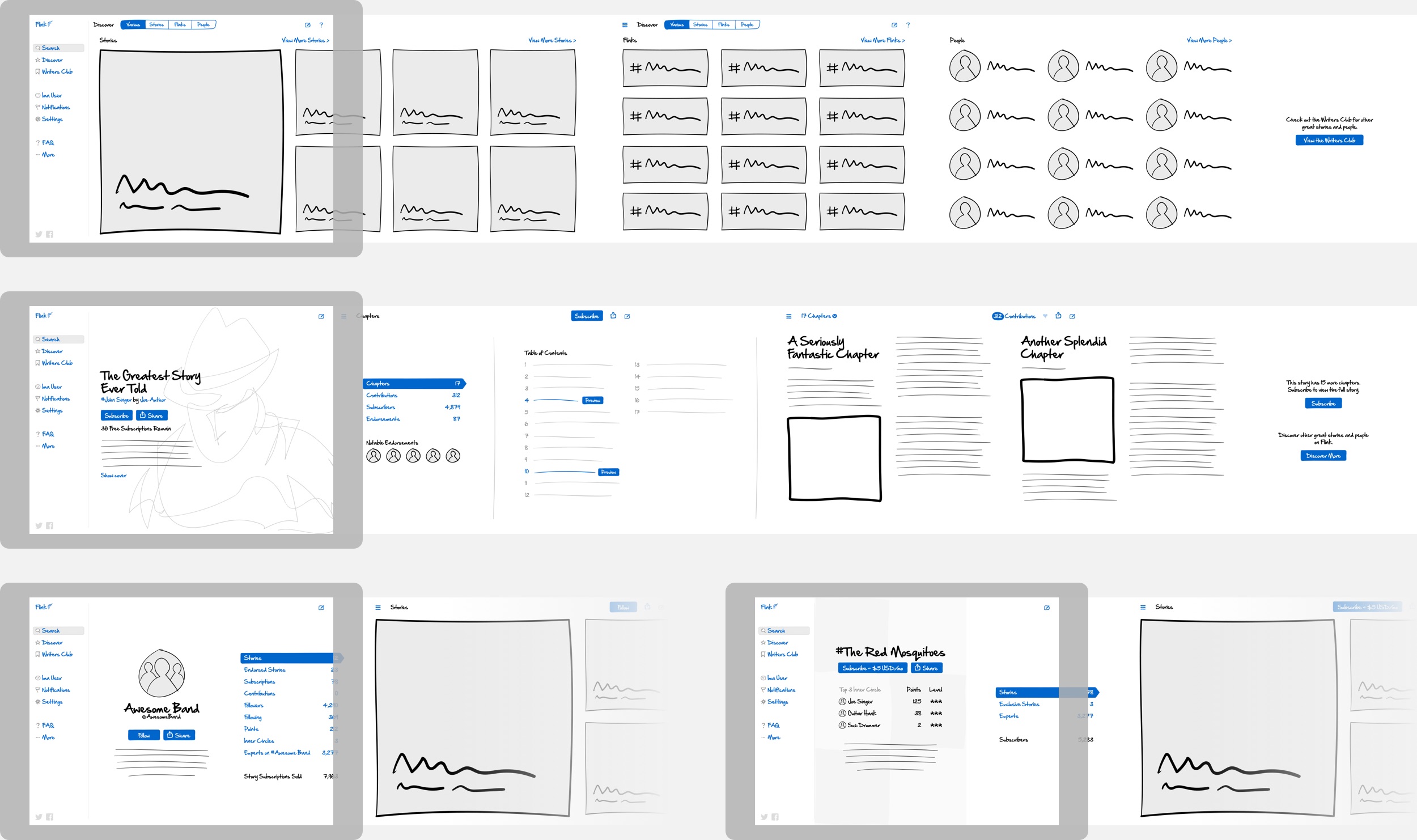
Visual Designs
Time to add a fresh coat of paint to the new UI. Big, bold images filled the story cover pages and custom colours added another piece of flare.

Early designs when the product was still called FlinkFame.
The Promo Site
Since the web app had switched to horizontal scrolling we felt that the promo site should match. This would help users become accustom to the unique method of navigation prior to logging into the app and keep everything consistent. We also incorporated stories and profiles from within the app onto the home page so that users could immediately see what the product had to offer.
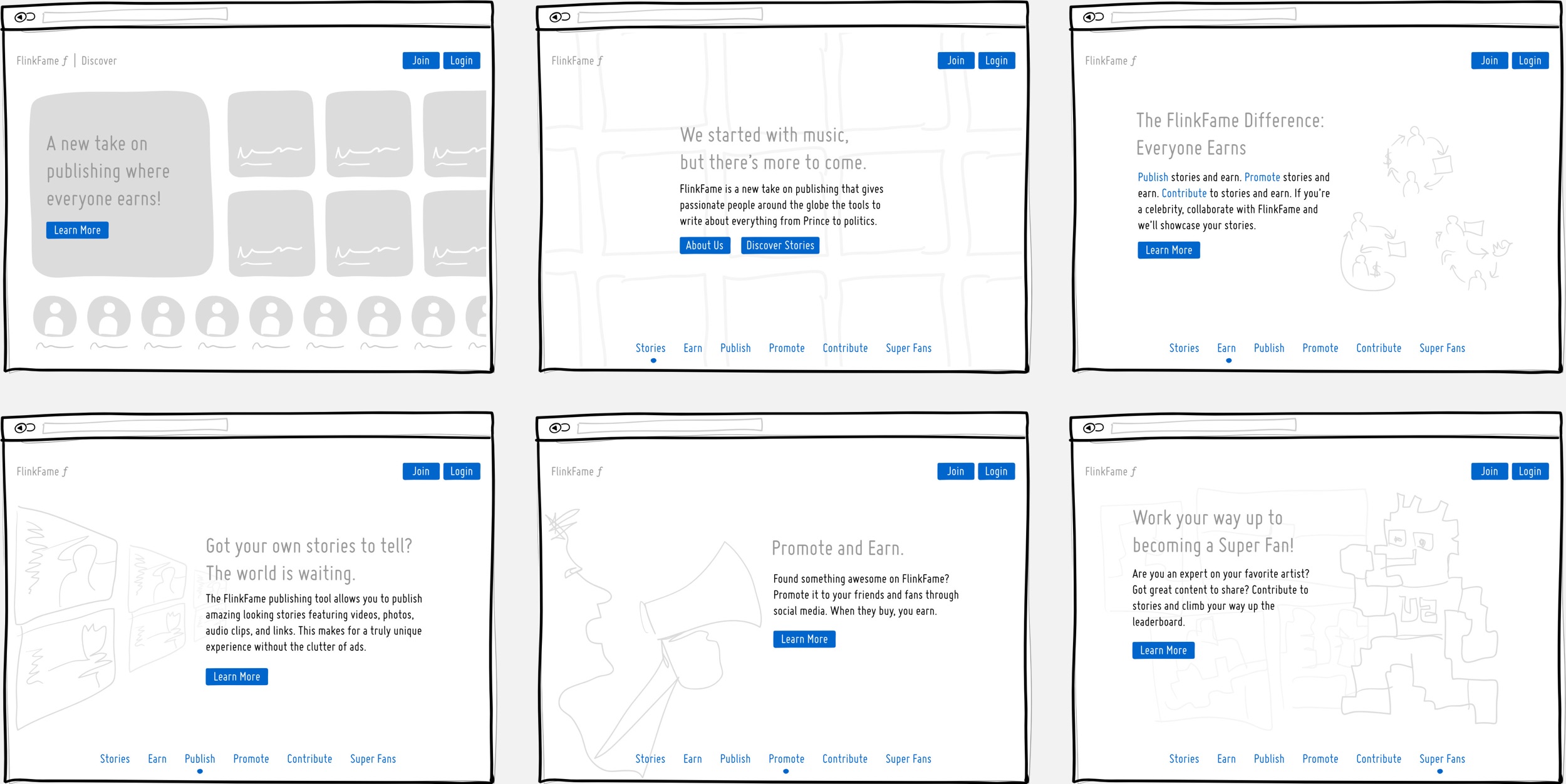
Wireframes of the home page and ‘Learn More’ section which walks the user through the product and it’s benefits.

The finished designs based on the wireframes above.
Less Isn’t Always More
As we tested the new app UI with users it was clear that we had ventured a little too far into the land of minimalism. Time to course correct. We chose to display the once hidden main menu and did away with the layered hierarchy mentioned earlier. Several other changes were made to the UI to make it more intuitive and the design was updated slightly. Also, during this stage was when the product was renamed to FlinkTO.
Prototype
This time around I wanted to be able to play around with a more functional prototype rather than an interactive PDF. Basically it needed to scroll like the real app so that we could see if the new UI was worth pursuing so I put together a prototype on the iPad using the new wireframes I had created. I used Flinto (not to be confused with FlinkTO) to build the prototype but initially I wasn’t sure if this would be possible since Flinto only allowed vertical scrolling. The solution was actually quite simple: rotate the designs 90° so they would be sideways when scrolling vertically, then turn on ‘Orientation Lock’ on the iPad and rotate it -90°.
The prototype allowed us to test some of the main pages with the updated UI.
Visual Designs
Although similar to the previous designs, the structure was updated and there were a lot of refinements that made the product feel more polished.

The final FlinkTO web app.
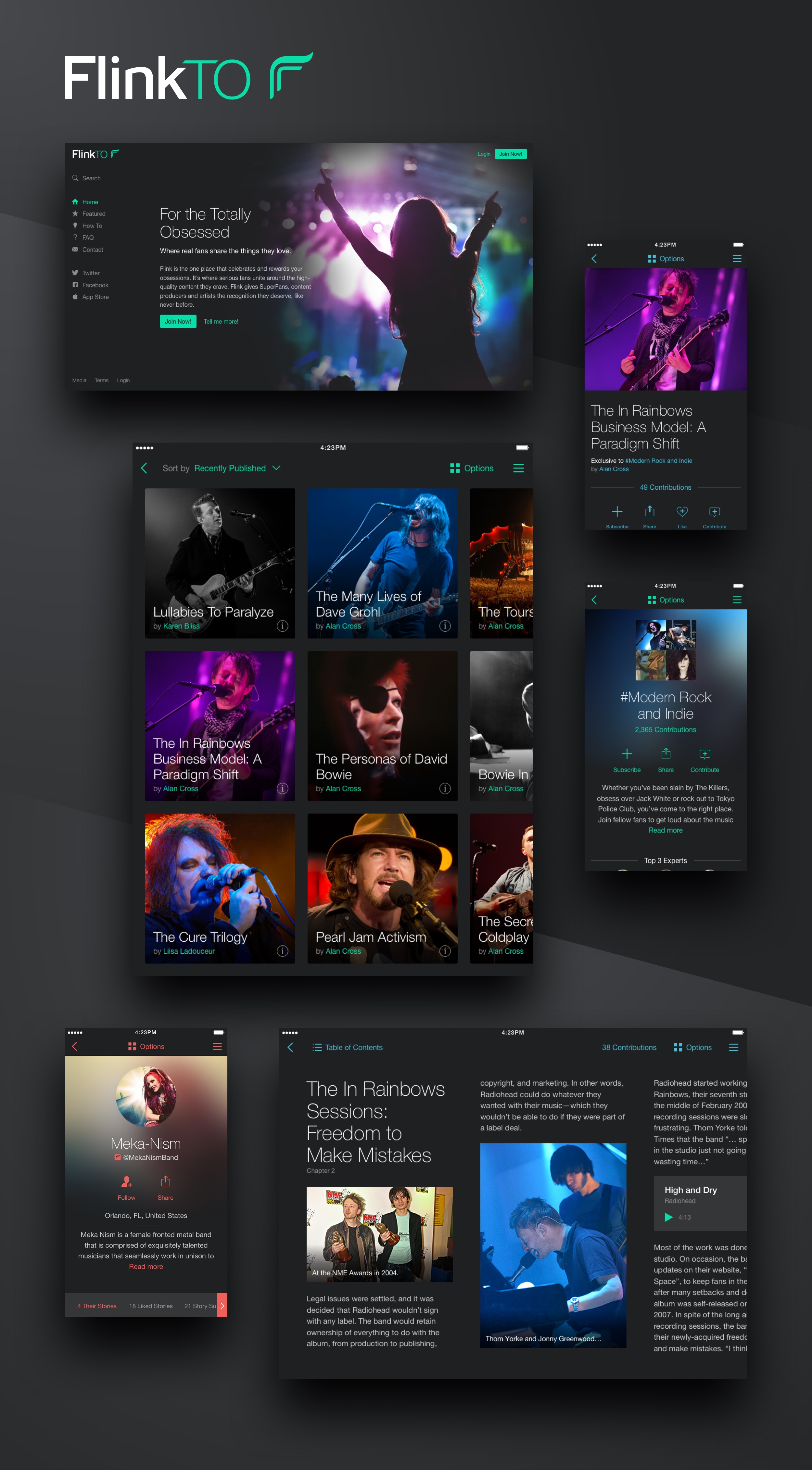
Promo Site Update
Since the web app was tied into the promo site we needed to update the promo site as well. User testing revealed that the our instinct to put the stories and profiles from within the app on the home page wasn’t quite the grand idea we thought it was. Since users weren’t familiar with the product they would rather learn a little more about it before diving into the app’s content. The new home page focused on features and benefits and we showcased some of the stories on another page.

The final FlinkTO promo site.
The iOS App
As the web app underwent the above changes we put the iOS app on hold for the most part. Initially we created a simple iPhone app for users to post comments – mostly for our own internal content team. Then, once the web app was solidified we focused on bringing the iOS app up to speed.
A lot of the iPad content would retain the same layout as the web app but certain elements of the navigation would change to better suit the iPad form factor. As for the smaller iPhone version, the screen size made horizontal scrolling awkward and more difficult to browse through content so we opted for the more traditional vertical scrolling.

Some of the screens from the iOS app on iPad and iPhone.
Wrapping Up the Flink Trilogy
I feel like this is the finale of the Flink trilogy – which, by the way, could have easily been split into a tetralogy but I thought that would just be too much. The Flink product was ever-changing and I learned a lot working on it through the various stages. We made some mistakes along the way but that’s all part of the learning process and often times the most valuable.
Feel free to check out the first two parts of the series if you haven’t already done so – Flink12 and Flink*.
The last screens of FlinkTO before it split into two separate products – MoviesTO and MusicTO.
